


Think about a place that has always made you feel at home.
Perhaps it's your grandparents' living room, with its familiar wallpaper and afternoon sunlight. Maybe it's the colour of your childhood bedroom, the pattern of an old blanket, or the stars you used to look at before falling asleep.
We rarely notice the colours around us when we're little. Yet familiar places become intertwined with the people, routines and experiences we remember.
That makes choosing nursery wallpaper more interesting than it first appears. You're not simply deciding between blue and pink, a forest and a sky, or a playful pattern and a delicate mural. You're creating the backdrop to everyday moments: bedtime stories, sleepy cuddles, first discoveries and the ordinary rituals that make a house feel like home.
So what does science actually tell us about how children perceive colour? Can certain shades influence how they feel? And is there a right way to choose colours for a baby's room? Let's look at the research, a few rooms that have captured our imaginations, and how to choose wallpaper that feels right for your family.
1. A baby's first colours: how vision develops
The world your baby sees in their first weeks is quite different from the one you see.
Newborns have limited visual acuity, so they can't see fine detail as clearly as older children and adults. Their ability to tell colours apart also develops rapidly during infancy.
A 2022 article in Child Development Perspectives examined how colour perception develops in the first months of life. The researchers describe a progression from very limited colour detection at birth to increasingly sophisticated perception. By around six months, babies can distinguish dimensions of colour, begin sorting colours into categories, and show early signs of recognising that an object's colour stays roughly the same under different lighting.
Why contrast matters more than colour at first
A newborn's world is soft and close. Babies see best at about 20 to 30 cm, roughly the distance to your face during a feed, and anything further away is blurry.
What newborns pick up most easily is contrast: the edge where light meets dark. That's why a baby may gaze for a long time at a bold black-and-white pattern, while subtle differences between similar shades barely register.
Colour arrives in stages. Reds and greens become easier to tell apart first, blues and yellows later, and most babies have good colour vision by around five months.

2. Does blue really calm children? What colour psychology tells us
Blue is calming. Yellow is cheerful. Green is relaxing. Pink is soothing.
You've probably heard these claims many times in colour psychology articles. But are they true? The scientific answer is more nuanced than a list of colours and emotions.
In a major 2014 review in the Annual Review of Psychology, Andrew J. Elliot and Markus A. Maier examined research on how colour affects psychological functioning. They found evidence that colour can influence emotions, thinking and behaviour in certain contexts. But those effects depend on the situation and on how the colour is experienced. The evidence doesn't support treating any colour as a universal emotional switch.
Consider a pale blue sky, a deep navy wall and a vivid electric blue. They're all blue, but they create very different impressions. The same goes for pink: dusty rose feels understated and sophisticated, while saturated pink feels bold and playful. Surrounding colours, lighting, personal experience and culture all shape how we perceive a space.
What happens when you ask children?
A 1994 study in The Journal of Genetic Psychology asked 60 children aged five to six and a half how nine different colours made them feel. Researchers Chris J. Boyatzis and Reenu Varghese found that the children responded positively to bright colours such as pink, blue and red more often than to darker ones such as brown, black and grey. There were also differences between children, some linked to age and gender.
It's an intriguing finding, with an important catch. The group was small, and the study measured emotional associations, not effects. It didn't show that brightly coloured bedrooms make children happier.
That distinction matters. Liking a colour, associating it with an emotion, and changing behaviour because of it are three different things.
So if you love blue for your baby's nursery, choose it because you enjoy the atmosphere it creates. If warm cream, soft green or muted pink feels more like home, those are equally valid choices. Colour psychology is fascinating, but it shouldn't become another set of rules parents feel obliged to follow.
3. Can a room become a feeling?
This is where colour, memory and everyday life meet.
Think about the colours and patterns you associate with childhood. Perhaps a yellow kitchen, a green garden, a familiar floral print, or a bedroom ceiling covered in stars. You may not remember every detail of the space, but familiar surroundings often become tied up with memories of the people and moments we shared there.
Film-makers know this too. Andy's blue-sky wallpaper in Toy Story became shorthand for a whole childhood.
In Paddington, the cherry tree painted up the Browns' staircase sheds its blossoms when the family is sad.
And in the opening of Up, Carl and Ellie lie on a hill spotting shapes in the clouds, a baby among them, before preparing a nursery of their own. In each case, a wall or a sky becomes part of the story.
That doesn't mean a particular wallpaper will reliably bring back a specific feeling decades later. Childhood memories are complex and personal, and they depend on far more than how a room looked.
Still, it's a lovely idea to keep in mind. A starry sky might become the backdrop to bedtime stories. A woodland mural might accompany years of reading together. A wall of illustrated animals might be where a child first learns to name the creatures they see.

Choosing a design that feels like your family
Maybe you love soft, dreamy colours and delicate patterns. Perhaps you're drawn to illustrated forests, whimsical landscapes or a sky full of stars. Choose a motif because it creates the atmosphere you want, and because you can imagine enjoying it for years.
4. Blue, green, pink or neutral? A practical guide to nursery colours
Once you set aside rigid colour psychology rules, choosing a palette gets much easier. Instead of asking which colour is best for children, ask a more useful question: what kind of atmosphere do I want to create?
Blue: an open sky or an underwater world
Blue suits sky-inspired nurseries, ocean themes and celestial designs. Pale blue with white feels light and airy, while deeper shades feel more dramatic. Consider how your chosen shade works with the room's natural light, furniture and textiles.
Try: the Dreamy Drift Hot Air Balloon Mural. Its watercolour balloons and soft clouds create an imaginative sky scene without an overly saturated palette.

Green: a little piece of the outdoors
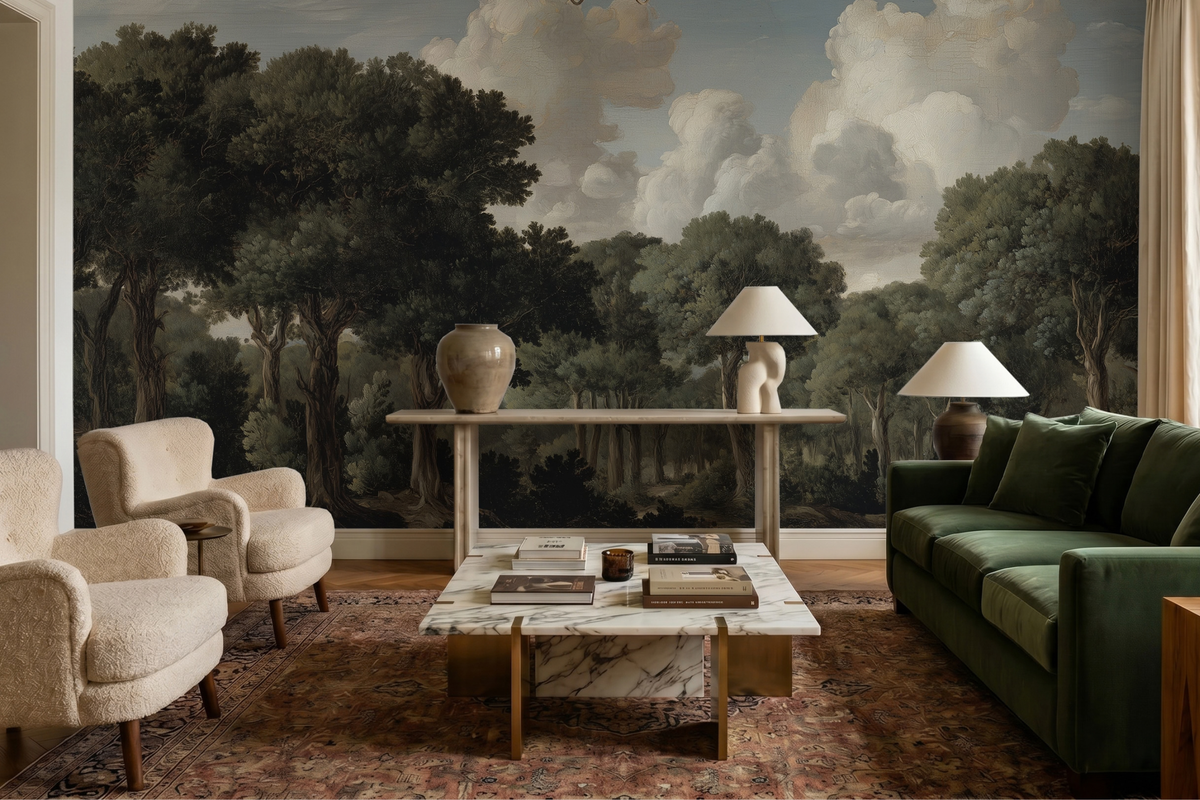
Green works beautifully with woodland, forest and botanical themes. Muted sage feels understated, while deep forest greens feel richer and more dramatic. Nature designs have a practical advantage too: trees, mountains and landscapes stay appealing as a child grows.
Try: the Golden Hills and Forest Peaks Mural. Its layered trees and misty landscape add depth and character while keeping the palette restrained.

Pink: playful, sophisticated or somewhere in between
Pink can be soft, bold or beautifully sophisticated. Dusty rose and pale blush create a very different look from vivid pink. There's no need to choose pink because you're decorating for a girl. Choose it because you like the shade.
Pair softer pinks with cream, natural wood or muted green for balance, or go brighter if you prefer something playful.
Explore: our pink wallpaper collection.

Yellow: a little sunshine on the wall
Yellow brings warmth and brightness. Butter yellow, pale ochre and vivid lemon each have a different personality. Yellow is often called a mood-boosting colour, but there isn't enough evidence to say yellow wallpaper reliably lifts children's moods.
Instead, think about how much yellow you want and which shades you'd enjoy seeing every day. A few sunny details against a softer background can work just as well as a fully yellow wall.
Try: the Golden Meadow Hopper Mural for soft, sunny stripes, or browse our yellow wallpaper collection.

Neutrals: subtle doesn't mean boring
Cream, beige, ivory and soft grey create a timeless backdrop that lets patterns and illustrations take centre stage. Neutral wallpaper doesn't have to be plain: a misty forest, a mountain landscape or a delicate pattern of clouds adds shape and depth without strong colour. Neutrals also pair easily with colourful toys, books, textiles and artwork.
Try: the Rolling Clouds in Stormwashed Sky Mural for soft white-and-grey clouds, or explore our neutral collection.

5. How to choose nursery wallpaper you'll love for years
You don't need to be an expert in colour psychology to create a beautiful nursery. A few practical points make the decision much easier.
Start with one design you love. Rather than coordinating lots of colours and patterns, begin with a wallpaper that captures the atmosphere you want. Then let it guide your bedding, curtains, furniture and accessories.
Think about pattern scale, not just colour. A large mural with simple shapes feels very different from a dense repeating pattern, even in the same palette. If you love a detailed design, consider it for one focal wall. If you want a consistent look throughout, a repeating wallpaper may suit better.
You don't have to decorate every wall. A statement wall gives a nursery plenty of character without covering the whole room in a detailed print. It's a good option if you love bold wallpaper but want the room to feel balanced.
See it in your actual space. Natural light, lamps, flooring and furniture all change how a colour looks. A soft grey may look warmer next to wood than on screen, and a pastel can look more saturated in bright daylight. If you're unsure, order a sample and look at it at different times of day.
Check the practical details. For a nursery, it's worth asking:
- Are the inks and materials low-odour and free from harmful substances? Chic&Kiddo wallpapers are made from eco-friendly premium materials and are designed and produced in Europe.
- Can it be wiped clean when little hands (or crayons) reach it?
- If it's peel-and-stick, does it come off cleanly when you redecorate or move out? Many renters find this especially useful.
Choose something that can grow with your child. Babies become toddlers, and toddlers become schoolchildren with new interests. Landscapes, mountains, stars, clouds and timeless patterns work across many ages. Playful designs are still a great choice; you can let the wallpaper set the room's atmosphere and change the smaller details as your child grows.
A little colour, a lot of memories
Science tells us that babies' colour vision develops rapidly in infancy, that children form emotional associations with colours, and that how we perceive a shade depends on much more than its name.
What science doesn't give us is a formula for the perfect nursery. Blue doesn't guarantee better sleep. Yellow doesn't automatically make children happier. And no wallpaper can promise a lifelong emotional response.
But we can choose colours and patterns thoughtfully, create spaces that feel welcoming, and make room for the everyday experiences that give a home its meaning. Maybe that's a misty forest stretching across the wall, a sky full of stars, a landscape in soft pink and lavender, or a playful pattern that makes you smile every time you walk in.
The best nursery isn't the one that follows the most rules. It's the one that feels right for your family. And years from now, your child may remember the little details of that room, not because a colour was supposed to make them feel something, but because it was the backdrop to a childhood full of familiar faces, stories and love.
Ready to find your nursery's colours? Explore the Chic&Kiddo nursery wallpaper and mural collection, from soft, understated patterns to imaginative statement murals.
Frequently Asked Questions About Nursery Wallpaper
1. Is Chic & Kiddo wallpaper safe for babies and children's rooms?
Chic & Kiddo offers PVC-free wallpaper options designed for indoor spaces, including nurseries and children's rooms. Our PVC-free self-adhesive wallpaper is made from polyester textile with a matte finish and is described as odourless and tested for harmful substances. Always follow the product-specific installation instructions and allow the room to air out as recommended before use.
2. What is the difference between peel and stick and traditional wallpaper?
Peel and stick wallpaper has an adhesive backing, so you can apply it directly to a properly prepared wall without additional wallpaper paste. Traditional wallpaper requires a separate wallpaper adhesive. Chic & Kiddo offers different material options to suit different preferences, so check the product details to choose the right one for your project.
3. How do you install peel and stick wallpaper in a nursery?
Start with a clean, smooth, dry wall and follow the installation instructions supplied with your wallpaper. Carefully align the first strip, peel away the backing gradually, and smooth the wallpaper onto the wall as you go to minimise air bubbles. For the best results, prepare the wall properly and check that the surface is suitable before installation.
4. Can peel and stick wallpaper be removed without damaging the wall?
Peel and stick wallpaper is designed to be easier to remove than many traditional wallpaper options. However, the result depends on the wall's condition, paint type, surface preparation, and how long the wallpaper has been installed. Follow the removal instructions and test a small, inconspicuous area first, as damage-free removal cannot be guaranteed on every surface.
5. How do I calculate how much wallpaper I need for a nursery?
The amount depends on your wall dimensions, the wallpaper format, and the design's pattern repeat. Measure the height and width of each wall you want to cover, and account for doors, windows, and any additional material needed for matching patterns. Use our wall measuring guide to help calculate what you need.
6. What colours are best for a baby's nursery?
There is no single best colour for every nursery. Soft greens, muted blues, warm neutrals, gentle pinks, and nature-inspired shades are popular choices, but the right palette depends on your preferences and the atmosphere you want to create. Research suggests that children develop emotional associations with colours, although these can vary with age, culture, and personal experience. Choose colours you enjoy seeing every day rather than relying on strict rules about which colours are supposedly calming or stimulating.
Can I customise a nursery wallpaper design?
Absolutely! If you have a specific idea for your nursery wallpaper, we'd love to hear about it. Share your inspiration, preferred colours, themes, or sketches with us, and we can work with you to create a unique wallpaper design tailored to your vision and space.
Email us at hello@chicandkiddo.com to discuss your ideas and start your custom project.
Can I order a wallpaper sample before buying?
Of course! Ordering a sample is a helpful way to see a design in your own space before making a decision. You can check how the colours look in natural and artificial light and see how the pattern works with your furniture and other decor. This is particularly useful when choosing between several designs or colour palettes.

Leave a comment
This site is protected by hCaptcha and the hCaptcha Privacy Policy and Terms of Service apply.